ShopDreamUp AI ArtDreamUp
Deviation Actions
Description
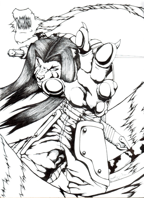
here is the inked version, I kinda liked how it turned out and all... too late if you crit it now, cuz its inked. I absolutely refuse to edit this in the computer.  hehehehhe
anyone wanna color this? ^_^ note me ^_^ ill email you a larger piece for coloring ^_^
-DOX
anyone wanna color this? ^_^ note me ^_^ ill email you a larger piece for coloring ^_^
-DOX
Image size
505x695px 167.95 KB
© 2006 - 2024 jan-michael9500
Comments33
Join the community to add your comment. Already a deviant? Log In
i like this one better than the first coloured one you linked me to. you want me to critique it but it says "critique not desired" XD; lol
okay i'll critique anyway coz you asked me to.
the one thing that is REALLY bothering me about this....is.....his body. where is it? o_O you can see his legs and his hip, then the hand that is covering where his body should be, but....
i mean i know he's suppose to be hunched over, but the lack of torso anywhere makes it look very awkward. it looks like his head is growing out of his waist. even with the hand close to the viewer like that and covering most stuff, other parts of the body should be visible. i think the fact that the head is so low crouched down is the main problem, it would be ahrd to bend your back so much that way to get it positioned like that so close to your crotch XD
the hand is pretty good, i think that's my favourite part. teh shading is nice and dynamic, but the anatomy seems to start falling apart towards the bottom of the hand. where did the other side of his palm disappear to? o.o the fingers also seem to change sizes and parts on the pinky and ring finger seem to vanish. foreshortening is really hard so i won't hit you so much for that XD;
okay one last thing....i said before that i really liked the dynamic dark shading, but it's only in a few places. it looks really uneven to not have it everywhere else. also, there is WAY too much empty space in the background. i think the image would be a lot stronger overall if it was filled in with some dark background of some sort, even just some solid black would have greatly strengthened it.
hope that was okay :3


